«Return to Blog List This Case Study Trend is HUGE
It’s true.
My eyesight isn’t as good as it used to be.
But I must not be the only one who’s drawn to larger text.
Case studies, and most marketing content, are going BIG.
From the images to the text, everything has gone way up in pixels and font points.
I’m not a web usability expert, but I’m guessing this trend is because larger is more readable.
I did a random web search for case studies and nearly every site I saw had big, bold images and text.
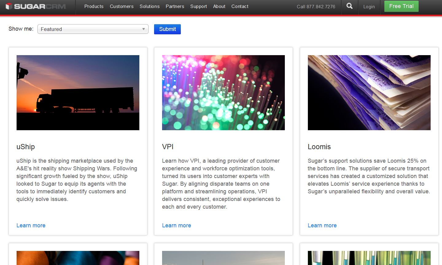
Whether it’s the customer success home page on a company’s site…
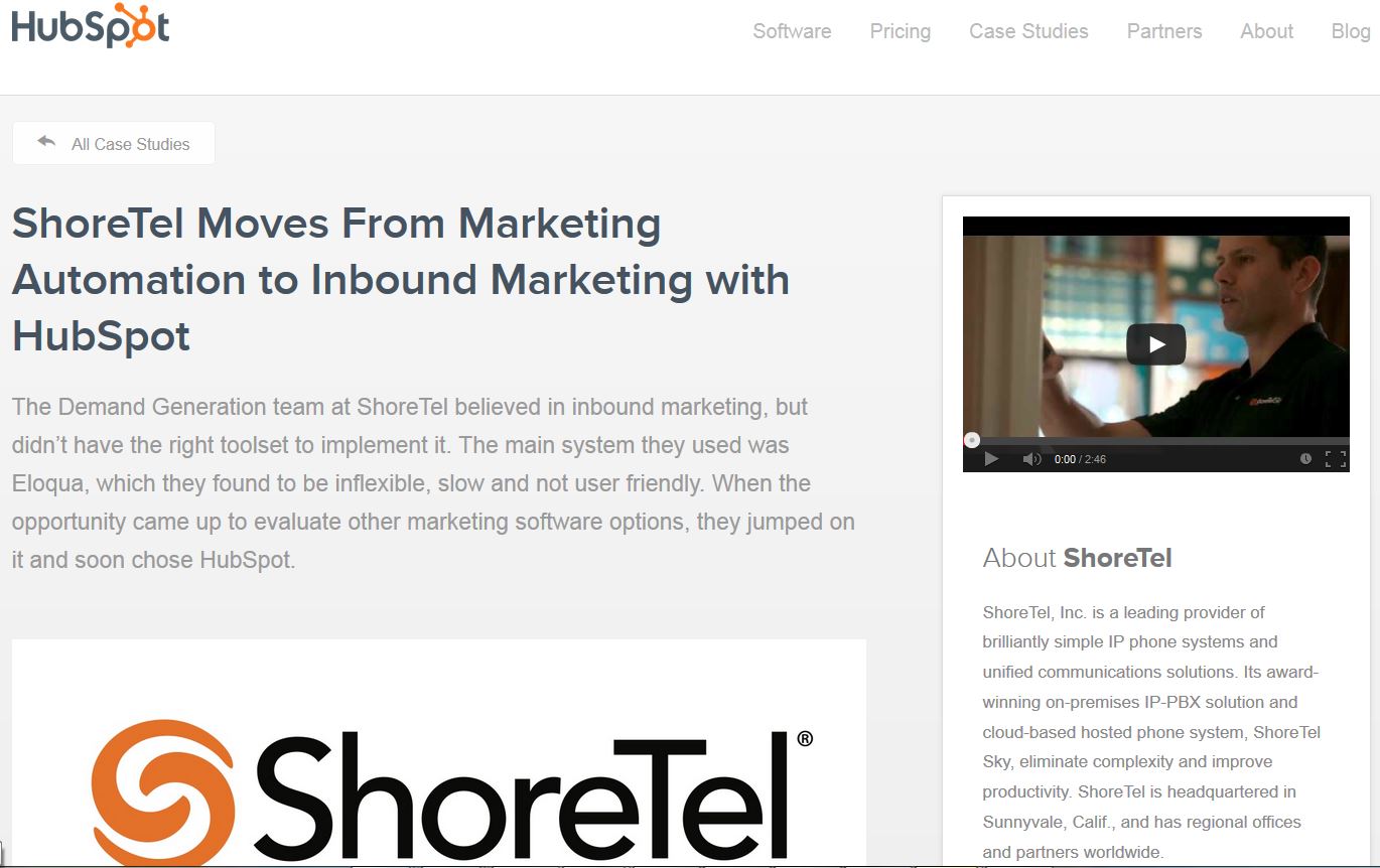
Or the landing page for an individual case study…
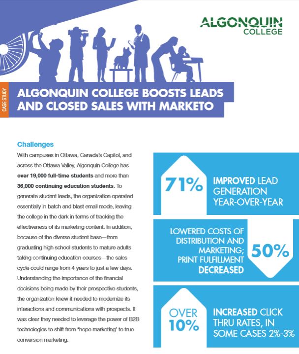
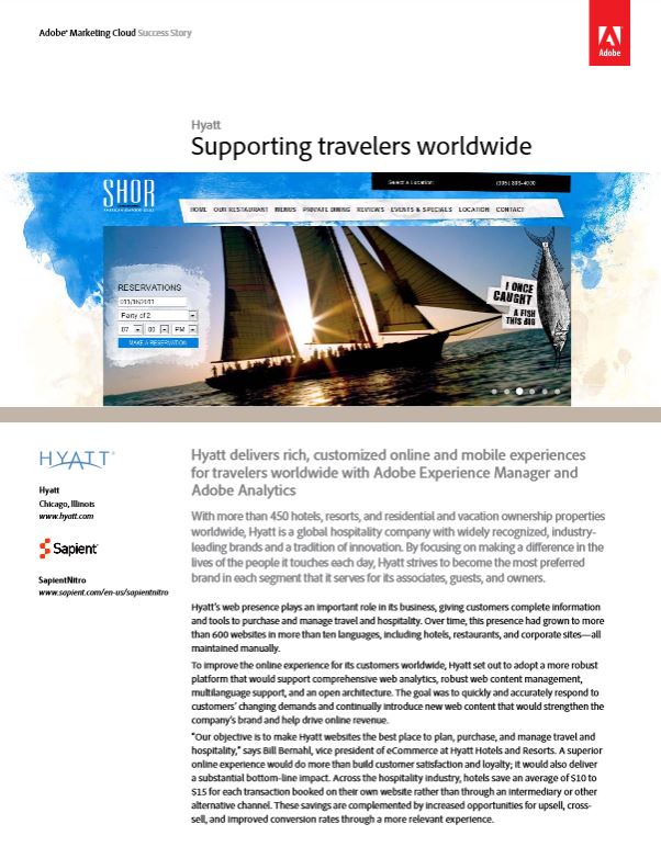
Or the actual PDF of a case study…
…it’s all super-sized.
NOT More Words
By larger, I don’t mean case studies are longer than ever before. They’re just bigger in every way. Each piece, whether text or graphics, has been enlarged.
Word count may be the same, but today’s case studies are often spread across two pages instead of one, or four pages instead of two.
I think the expanding formats also reflect that most people consume content electronically. Keeping a case study at two pages isn’t as important anymore since companies are not (usually) printing hundreds for handouts. People read and share them mostly online.
Check out some examples below. Click on each image to see the pages at their actual scale.
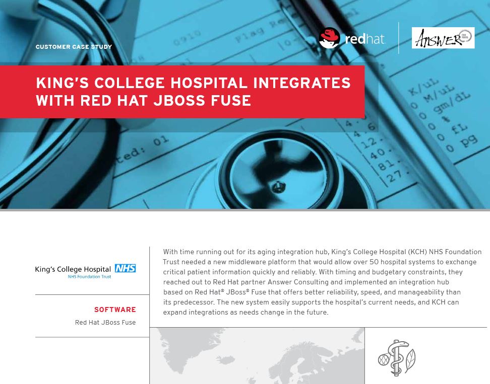
Big headlines:
Big photos:
Big body copy:
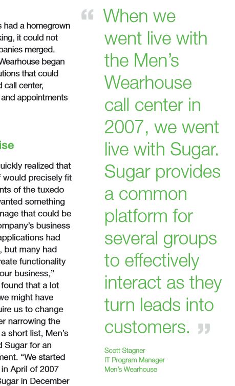
Big pull quotes:
Big graphics:
Big scrolling story teaser:
Organizations are also more creative in their presentation. They put thought into how they organize their stories on the main case studies page, how they present the teaser web summary and the way they lay out a single case study.
Apparently readers want us to go big.
Do you like the larger format? What are your favorite case study examples?





Good insights Casey. The optimisation tricks of landing pages and campaigns have begun to trickle into story pages, which is awesome !
Do readers really want us to go big, or are you just noting a prevalent trend in marketing/case studies at the moment? Correlation does not equal causation- I’d be interested to see some conversion rate data comparing larger/smaller text in our current mobile age. Either way, you’re onto something!
Hi Madi,
Well, that’s a very good question. I don’t know if the industry thinks that bigger is better or if there are traffic or other stats to indicate more of a scientific drive behind it. But I would think that the mobile trend is making things bigger for readability. It will be interesting to see how mobile continues to change web design trends.
Thanks for commenting!
Casey