«Return to Blog List Customer Stories in Action: Clarity.fm
I’m always on the lookout for new examples of customer case studies, and last week, the site Clarity came into focus.
Clarity is a simple and super cool site where businesspeople can request phone calls with experts to get answers and advice.
Clarity created several customer success stories that capture the experience of some of their users. From the main page of stories to each story, Clarity’s format is an attractive departure from the typical design.
On the main page, Clarity presents the customer stories in playing-card format. Each has the entrepreneur’s name, photo and a one-sentence description of their experience with Clarity.
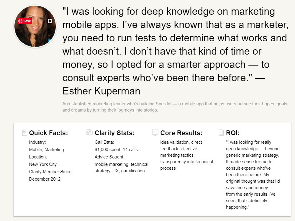
Then each profile highlights the story mostly in the customer’s own words. See an example of a full story here.
What I like:
- Customer photos – Although I like the way customer photos look in success stories, I don’t often recommend they be used because it can be difficult to get pictures that look consistent and professional enough without splurging for a pro photographer. That’s an especially tough proposition when customers (and photographers) are spread all over the world. But photos are an especially nice touch when you’re focused on the person as the customer versus a company as the customer. (It would be interesting to know if Clarity hired pros to capture all of its customers.)
- First name usage – Usually customer stories refer to individuals by their last names, but these stories use first names. This approach works well and is consistent with the focus on individuals.
- The big quote – Each story is topped with a marquee customer quote next to the customer’s photo, instead of a headline. It’s consistent with the rest of the story where we feel a little like we’re having a conversation with the featured customer.
- The overview box – You’ve got to have a summary box, and this one works well with Quick Facts, Clarity Stats, Core Results and ROI. Skimmers can get the basics here and move on for more detail.

- The subheads – The subheads are mostly customized for each story, such as “Omar’s Story,” “Life Before Clarity,” a customized subhead to reflect the value, and lastly, “Key Calls.”
- Key Calls – This is a brilliant addition to each story. “Key calls” shows readers the type of insight the customer sought and spotlights some of the experts on the site.

- Calls to action – The stories have a couple of big, green “Start Using Clarity” buttons right on them, which makes it very easy to move forward.
- Nice branding – All of the company’s success stories are founders of startups. I assume that’s their audience and they’ve done a nice job reinforcing it here.
They might want to add…
- Social sharing links – I can see readers wanting to share these stories with friends or colleagues. Add social sharing buttons and a print/download option for those who want to do more than bookmark it or copy and paste the link.
- What is Clarity? – I found the customer stories first, before knowing what Clarity actually is, and was a little confused at the beginning of each story. A boilerplate sidebar with one or two sentences would help orient the reader to what Clarity provides.
- More diverse stories – If Clarity wants to market to non-founders (and maybe they don’t), such as executives and leaders, then adding success stories on those folks would help target a broader audience.
In short, Clarity sold me. I immediately began thinking of business questions I have and friends I can tell about the site.
How about you? Do Clarity success stories sell you?


